A support dashboard can be beautifully designed and still fail its real job. In one industry comparison, teams moved from a crowded 40-tile dashboard to a focused 6-KPI layout and saw weekly unique openers rise from 18% to 71%, median time to first verbal decision in standup fall from 14 minutes to 4 minutes, and “I don't trust this number” tickets drop from 9 to 1 per month, as summarized in this dashboard simplification case comparison. That result matters because customer support leaders don't need more tiles. They need faster decisions.
What a support dashboard should reveal is simple: where demand is rising, whether conversations are getting resolved, how customer sentiment is changing, and which questions the system still can't answer. That's the lens used here for these analytics dashboard examples. Each one is evaluated as a reusable support pattern: core metrics, layout logic, widget usefulness, implementation effort, and the action the dashboard should trigger.
AgentStack is a relevant product context because it combines website chat, email, Slack, and voice analytics with resolution outcomes, sentiment trends, and unanswered-question tracking in one environment.
Every widget should support a decision.
Table of Contents
- 1. Docs - Analytics
- 2. Databox
- 3. Geckoboard
- 4. Google Data Studio (Looker Studio)
- 5. Tableau Public
- 6. Grafana
- 7. Metabase
- Top 7 Analytics Dashboard Tools Comparison
- Turn Dashboard Inspiration Into a Support Review Loop
1. Docs - Analytics
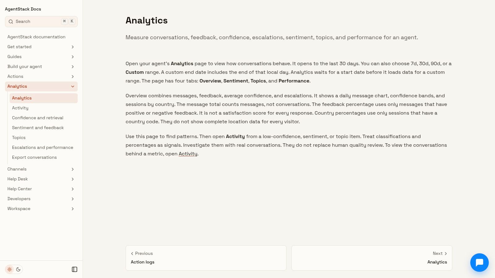
Docs - Analytics is the strongest example here if your benchmark isn't visual polish but operational usefulness. The pattern is closer to a support control panel than a BI gallery. It centers the metrics a support lead reviews each week: conversation volume, resolution outcomes, sentiment movement, and unanswered questions that signal a knowledge gap.
That structure fits how modern dashboards evolved. Dashboard history in ServiceNow's overview shows the shift from static executive summaries to team-wide operational tools, which is why effective dashboards now tend to revolve around decision-critical metrics and recurring review cycles in support, operations, finance, and sales, as described in this dashboard history and adoption overview. AgentStack's analytics fit that model well because they don't stop at reporting. They point toward remediation.
Why the layout works for support
Support teams usually need one first-screen answer: are we handling incoming demand well enough, and where is the system failing? AgentStack's cross-channel setup matters because fragmented support creates false calm. Website chat may look healthy while email backlog or Slack escalations worsen.
The better pattern is a top row that answers four questions fast:
- Demand: Are conversations rising by channel or time window?
- Resolution: Are customers getting answers without human intervention?
- Quality: Is sentiment improving or slipping?
- Coverage: Which unanswered questions should become new content, actions, or routing rules?
That's more useful than a generic KPI collage. It also aligns with the idea behind intelligent supply chain reporting, where the best dashboards connect monitoring to intervention rather than stopping at visibility.
Best reusable pattern
AgentStack is especially strong when support operations depend on model choice and escalation logic, not just article quality. If unanswered questions cluster around a topic, the next action isn't abstract. Update ingested content, route harder conversations to a higher-reasoning model, add a custom API action, or create a human handoff rule.
Practical rule: If a dashboard shows unresolved demand without naming the workflow that should change, it's still a report, not an operating tool.
A few trade-offs matter. Smaller teams with low conversation volume may not see stable patterns immediately, and custom analytics still depend on instrumentation quality. But as a reusable support dashboard pattern, this is the clearest example of analytics that closes the loop between observation and improvement.
2. Databox
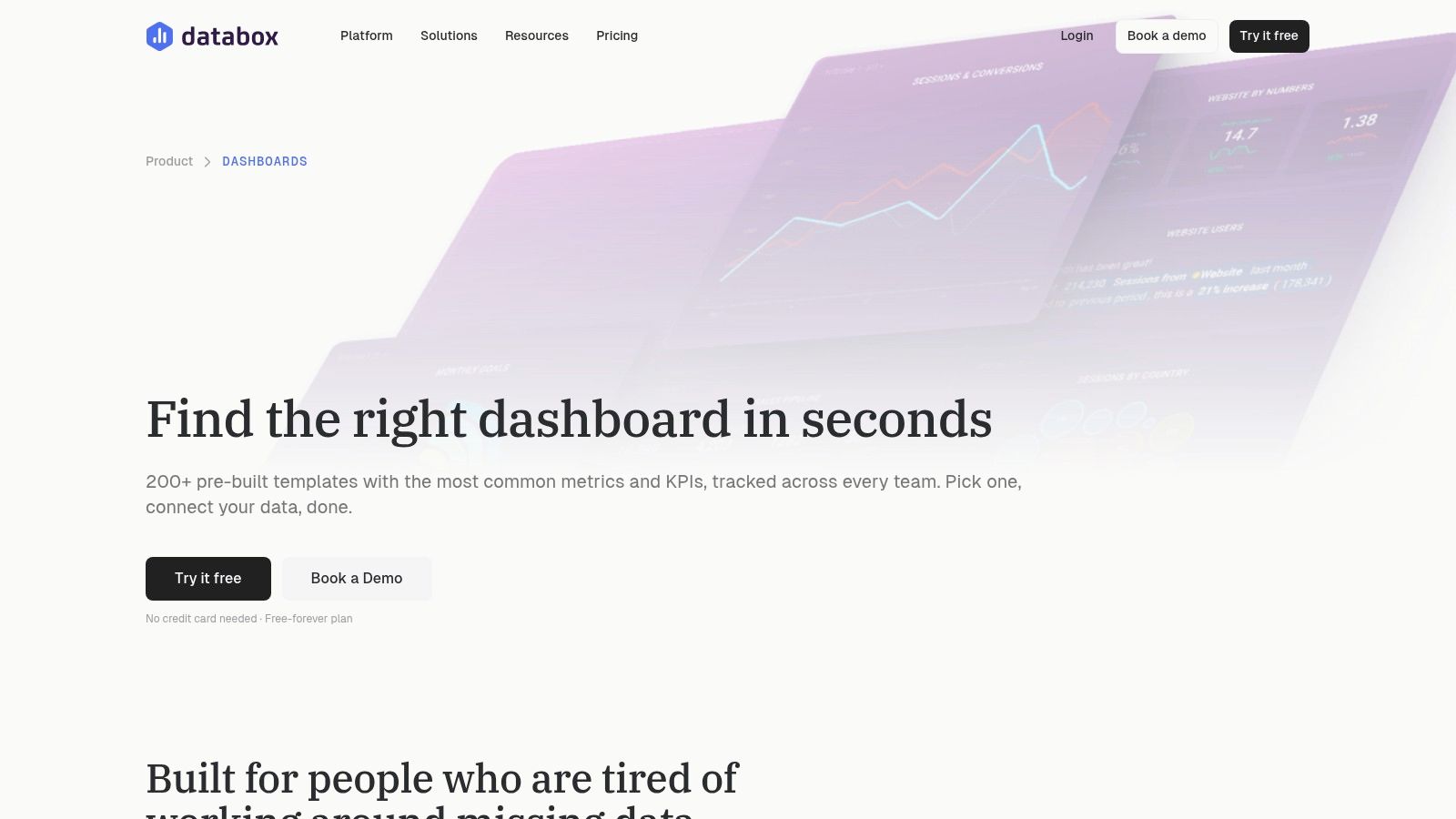
Databox is useful when the problem isn't missing ideas but slow setup. Its large template gallery makes it easy to inspect how teams group scorecards, trend lines, targets, and source-specific widgets. For support leaders, that matters because layout patterns are often easier to borrow than full KPI frameworks.
The support value isn't that Databox gives you one perfect dashboard. It gives you fast exposure to common visual structures you can adapt for queue health, SLA monitoring, response trends, or self-service performance.
Best support pattern to borrow
Databox works best as a starter kit for tactical dashboards. Use its example layouts to create a first view with volume, backlog, and resolution signals, then a second view for diagnostics such as channel split, topic trends, or article-performance context. That keeps the homepage simple while preserving room for deeper analysis.
A practical extension is to pair template inspiration with a stronger conversation-analysis layer, especially if you're evaluating conversation analytics software that can identify unresolved themes and agent failure patterns.
- Best for speed: Teams that need a presentable dashboard quickly.
- Best widget pattern: Scorecards plus compact trend charts for daily review.
- Main limitation: Complex support logic often needs more custom modeling than template-led tools provide.
Databox is a strong example of reusable dashboard scaffolding. It's less compelling if your support workflow depends on nuanced routing, sentiment interpretation, or unanswered-question analysis.
3. Geckoboard
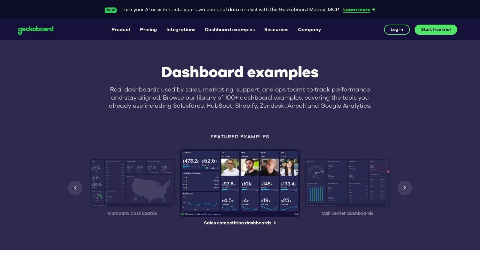
Geckoboard is the strongest example in this list of a support dashboard designed for intervention, not analysis. The layout assumes a supervisor is watching for queue risk, SLA drift, or channel spikes and needs to decide on staffing, routing, or escalation within minutes.
That focus changes what belongs on screen.
A reusable support pattern in Geckoboard is to organize the board by decision speed rather than by metric category. Put immediate action metrics first: open conversations, oldest waiting time, SLA at risk, and unresolved backlog. Follow with directional context such as volume trend, channel mix, and resolution rate. Reserve the last row for slower-moving quality signals like CSAT, sentiment trend, or recurring unanswered topics, because those inform process fixes more than same-shift triage.
This structure works because Geckoboard favors large status widgets, short trend lines, and simple comparisons. Those elements are effective for conversation volume and resolution monitoring, but they force discipline. If a support lead cannot explain what action a tile should trigger, that tile is probably consuming screen space without improving response quality.
One practical rule helps: only include a metric if a manager can change something during the current shift.
For customer support teams, the implication is clear. Geckoboard is useful as the top layer of a review system, not the whole system. It can show that unanswered questions are rising or that sentiment is slipping after a product launch. It usually will not explain which intents failed, which help content was missing, or which agent behaviors lowered resolution quality. Those questions need a second workflow for investigation and improvement.
Use Geckoboard as the live operations pattern. Pair it with a separate analysis layer for root-cause review, especially if your support process depends on sentiment interpretation, knowledge-gap detection, or unresolved-conversation auditing.
4. Google Data Studio (Looker Studio)
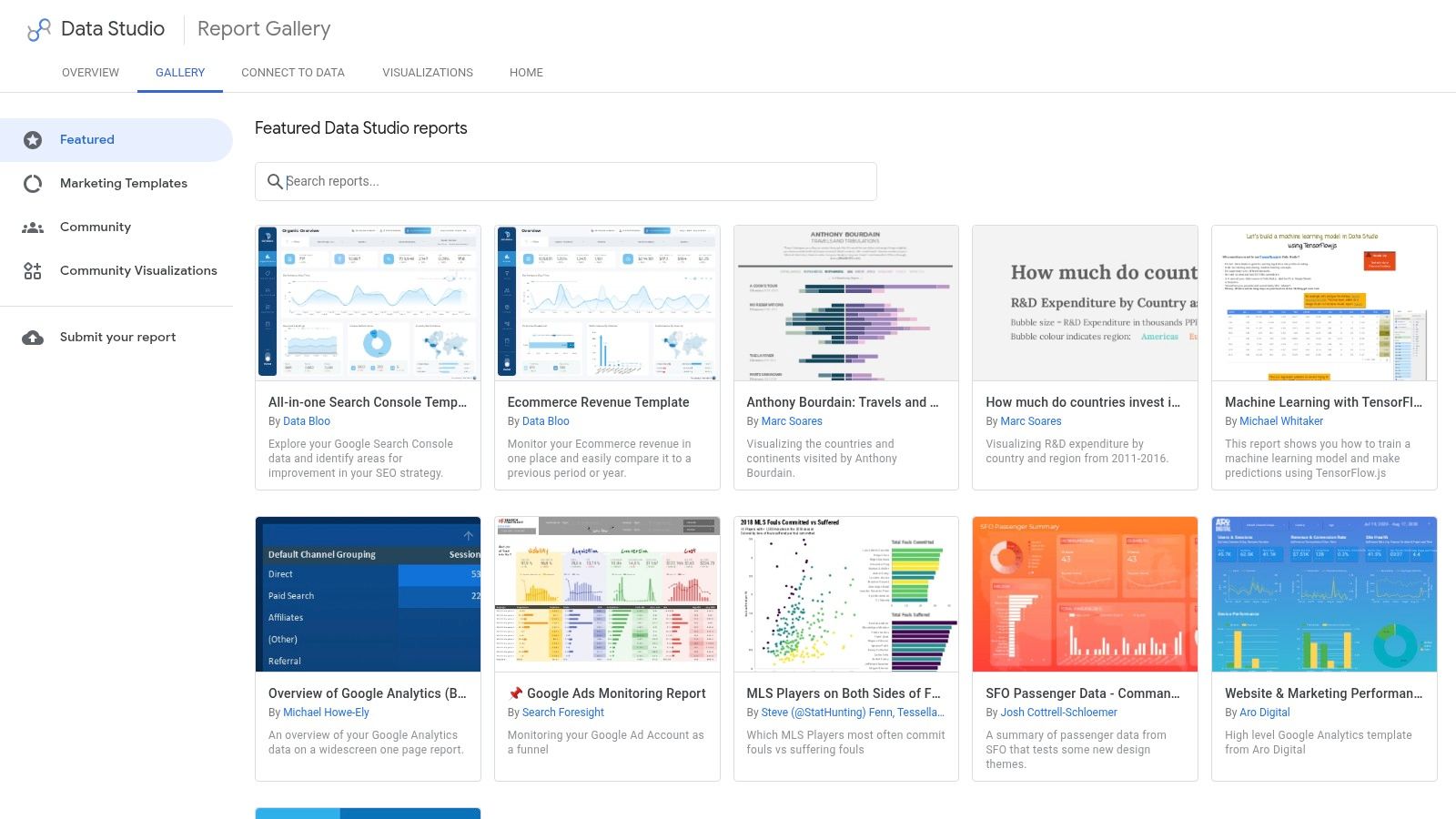
Google Data Studio (Looker Studio) is the fastest way to turn scattered support signals into one review surface. Its value is not the gallery alone. It comes from combining connectors, calculated fields, and reusable report pages into a dashboard pattern that links daily support activity to service improvement work.
Use it as a support analysis hub, not a wallboard.
A strong Looker Studio setup usually works as a three-layer report. Page one answers operational questions: How many conversations arrived, which channels drove the increase, how many remain unresolved, and where are unanswered questions accumulating? Page two explains resolution quality by team, topic, or issue type. Page three tracks follow-up signals such as sentiment, feedback themes, and recurring gaps in help content.
That layout matters because Looker Studio handles filters and page-level comparisons better than it handles fast, shift-based monitoring. Support leads can move from conversation volume to resolution rate to topic breakdown without rebuilding the report, which makes it useful for weekly review and manager analysis. The trade-off is speed. If a queue needs second-by-second attention, this pattern feels slower than a dedicated operations display.
The most reusable support pattern is a blended scorecard plus diagnostic tabs. Put the high-frequency decisions first, then make root-cause analysis one click away.
For example, a support team reviewing a product launch can place volume, backlog, first-response lag, and open issue category counts on the summary page. A second tab can isolate low-resolution topics or repeated unanswered questions. A third can compare sentiment before and after the launch, which is often the point where teams realize they need a clearer method for interpreting tone and frustration signals. This guide to customer sentiment analysis is useful when you need to define those rules before adding sentiment widgets to a dashboard.
Looker Studio fits teams that already have support data in several systems and need one place to compare demand, resolution, and customer reaction. It is less effective when access controls, metric governance, or real-time operational alerting are strict requirements. In practice, that makes it a strong pattern for support review loops that combine reporting and process improvement, especially before a team commits to a heavier BI stack.
5. Tableau Public
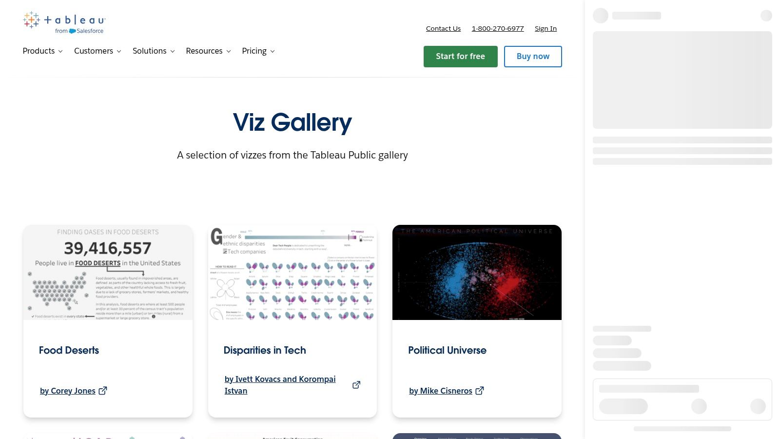
Tableau Public shows a hard truth about support dashboards. Clear decisions depend less on how many metrics you include and more on whether the layout separates monitoring from diagnosis from follow-up.
That makes the gallery useful as a design reference, not a support template. Tableau examples often use strong hierarchy, annotated trends, and drill paths that answer a sequence of questions instead of placing every chart on one canvas. For support teams, that pattern maps well to three review jobs: track conversation volume and resolution at the top level, isolate unanswered questions and sentiment shifts in the middle layer, then route findings into improvement work.
A reusable support structure in Tableau Public looks more like a reading flow than a KPI wall. Start with a summary band for volume, backlog, resolution rate, and first-response delay. Place a second layer underneath for queue splits, topic clusters, and low-performing channels. Reserve the bottom or a linked view for interpretation, such as which issue types create negative sentiment, which questions remain open across multiple conversations, and which fixes belong to training, routing, or product changes.
If you're deciding which support metrics belong in that summary band, this guide to KPIs in customer service helps narrow the list before the design gets crowded.
The trade-off is practical. Tableau Public is good for studying how to stage analysis across views, but it is built for public sharing. Teams handling private tickets, customer identifiers, or agent-level performance data will use it to borrow layout logic, then rebuild the same pattern inside a governed BI environment.
6. Grafana
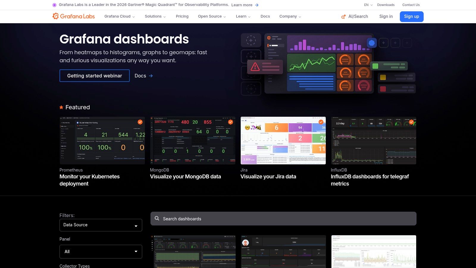
Grafana is the clearest example in this list of a dashboard pattern built for system behavior first. That makes it unusually useful for support teams running AI-assisted workflows, where customer outcomes depend on both agent performance and infrastructure reliability.
A standard support dashboard answers whether volume is rising, resolution is holding, and sentiment is slipping. Grafana adds a second question that many teams without observability miss: did the support system itself cause the change? If unresolved conversations spike after a routing service slows down or an action fails across a channel integration, the review workflow needs both views on one screen.
The layout pattern to borrow is layered correlation, not presentation polish. Place conversation volume, backlog, resolution rate, unanswered questions, and sentiment trend in the upper row. Directly beneath that, show the operational signals that can explain movement in those customer metrics, such as API latency, failed automations, queue handoff errors, model fallback rates, or channel delivery delays. The value is diagnostic speed. A support lead can move from "CSAT dropped at 2 p.m." to "handoff failures increased in the same window" without switching tools.
The support pattern AI-assisted teams often miss
Grafana works best when the dashboard is designed for incident review and support improvement at the same time.
A useful implementation usually separates three jobs:
- Detect the customer-facing change. Track spikes in conversations, slower resolution, negative sentiment, and repeated unanswered questions.
- Test the operational cause. Compare those shifts against latency, broken actions, escalation failures, and integration health.
- Route the fix. If the issue is content, update macros or knowledge sources. If the issue is routing or reliability, assign it to the systems owner.
This pattern is stronger than a KPI wall because it reduces false attribution. Teams often blame agents or content quality for a drop in outcomes that started with workflow errors, delayed automations, or unstable integrations.
The trade-off is clear. Grafana does not give support teams many ready-made business examples, so setup takes more translation work than tools built for BI audiences. But as a reusable support dashboard pattern, it fills a gap the other examples do not. It connects conversation analytics to operational failure modes, which is exactly what support teams need when volume, resolution, sentiment, and unanswered questions depend on automated systems as much as human replies.
7. Metabase
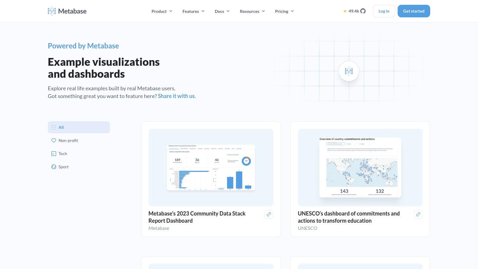
Metabase is the pragmatic choice in this list. Its examples tend to feel closer to how teams work: filters, questions, lightweight drill-through, and layouts that don't require a visualization specialist to maintain.
That practicality matters because dashboard adoption is still uneven. A survey cited in a dashboard adoption summary found that only about 25% of employees actively use the BI tools their companies purchase, while a separate industry report summarized there says Gartner tracked active usage at around 29% for seven years even as 87% of organizations reported increased analytics adoption, according to this dashboard adoption summary. Metabase's simpler style is a direct response to that gap. It favors dashboards people can revisit without training.
Best support use case
Metabase works well for support teams that need a repeatable review workflow more than a showcase dashboard. A strong support layout in Metabase would keep the homepage focused on conversation volume, resolution outcomes, sentiment change, and unanswered questions, then use filters for channel, date range, queue, or customer segment.
The best dashboard for most support teams isn't the most interactive one. It's the one people will open before the weekly review without being told to.
Its limitation is analytical ceiling. Complex custom metrics and advanced modeling often require SQL or upstream data work. But as a reusable customer-support pattern, Metabase gets an important thing right: clarity first.
Top 7 Analytics Dashboard Tools Comparison
| Item | Implementation complexity 🔄 | Resource requirements ⚡ | Expected outcomes 📊 | Ideal use cases 💡 | Key advantages ⭐ |
|---|---|---|---|---|---|
| Docs - Analytics | Medium, requires tagging & instrumentation 🔄 | Moderate, data volume, engineering for integrations ⚡ | Cross-channel metrics, actionable signals for retraining/escalation 📊 | Monitoring AI agents across chat, email, Slack, voice; compliance-focused teams 💡 | ⭐ Consolidated cross-channel visibility; enterprise controls & auditability |
| Databox | Low, one-click templates, minimal BI setup 🔄 | Low, connectors for common tools; paid tiers at scale ⚡ | Quick working dashboards and KPI templates for teams 📊 | Non-BI teams (growth, CX, RevOps) needing fast dashboards 💡 | ⭐ Rapid deployment from curated templates |
| Geckoboard | Low, focused TV/operational patterns 🔄 | Low, connectors for real-time sources; subscription ⚡ | Real-time operational KPIs and SLA/CSAT visualizations 📊 | Frontline teams and wallboards / live TV displays 💡 | ⭐ Strong operational widget patterns and fast implementation |
| Google Data Studio (Looker Studio) | Low–Medium, easy templating; advanced governance ups the complexity 🔄 | Low, free core product; Pro features require GCP billing ⚡ | Shareable community reports and web/marketing dashboards 📊 | Marketing/web analytics, community template reuse and sharing 💡 | ⭐ Free core product with large community template library |
| Tableau Public | Medium, requires Tableau skills for advanced vizzes 🔄 | Low for public sharing; higher for private enterprise hosting ⚡ | High-design interactive vizzes useful for storytelling & interaction 📊 | Learning visualization techniques, showcasing dashboards publicly 💡 | ⭐ High design bar; downloadable examples for learning |
| Grafana | Medium–High, requires query skills and time-series setup 🔄 | Moderate, data sources/infra; multiple deployment options ⚡ | Best-in-class time-series, observability, and real-time panels 📊 | Infrastructure/observability, monitoring IoT and real-time metrics 💡 | ⭐ Excellent time-series patterns and reusable dashboard JSONs |
| Metabase | Low–Medium, approachable; SQL for complex metrics 🔄 | Low, self-host or cloud; minimal ops for basic use ⚡ | Pragmatic dashboards, filters, and light drill-through patterns 📊 | Internal BI for CX/support, embedded dashboards, fast prototyping 💡 | ⭐ Easy from example-to-dashboard; open-source and embeddable |
Turn Dashboard Inspiration Into a Support Review Loop
The strongest pattern across these analytics dashboard examples is restraint. Good support dashboards don't begin with every possible metric. They begin with the decisions support leaders repeat: where volume is rising, whether conversations are getting resolved, whether sentiment is shifting, and what customers are still asking that the system can't answer.
Build the first view around those four signals. Put conversation volume and resolution outcomes at the top because they frame operational reality. Add sentiment trends next so quality doesn't disappear behind throughput. Then isolate unanswered questions in a dedicated improvement queue, because unresolved demand is usually the clearest roadmap for content updates, model-routing changes, or escalation design.
After that, add filters carefully. Channel filters reveal whether website chat, email, Slack, or voice behave differently. Time filters show whether a problem is chronic or tied to a release, campaign, or staffing pattern. If a metric can't change someone's next action, it doesn't belong on the front page.
A dashboard also needs ownership, not just design. Every metric should have a named reviewer and a recurring action:
- Volume changes: adjust staffing, triage rules, or channel routing
- Resolution drops: review prompts, model choice, or escalation thresholds
- Sentiment declines: inspect transcripts, broken flows, or missing context
- Unanswered questions: update ingested content, create new Q&A pairs, or add actions
Keep the review cadence visible. Daily checks suit queue health and SLA exposure. Weekly reviews suit knowledge gaps and recurring unresolved themes. Monthly reviews suit larger workflow changes.
The best dashboard isn't the one with the most widgets. It's the one that consistently leads to a measurable support decision.
Use this compact checklist when you build or revise yours:
- Front page only shows decision-critical metrics
- Every widget has an owner
- Every metric has a follow-up action
- Unanswered questions feed an improvement queue
- Filters expose channel and time differences without clutter
- The team reviews it on a fixed cadence
AgentStack gives support teams a practical way to build that loop. It combines website, email, Slack, and voice support with analytics for conversation volume, resolution outcomes, sentiment trends, and unanswered questions, so you can see where the agent succeeds and what to improve next. If you want a support dashboard that leads directly to content updates, routing changes, and better handoffs, visit AgentStack.